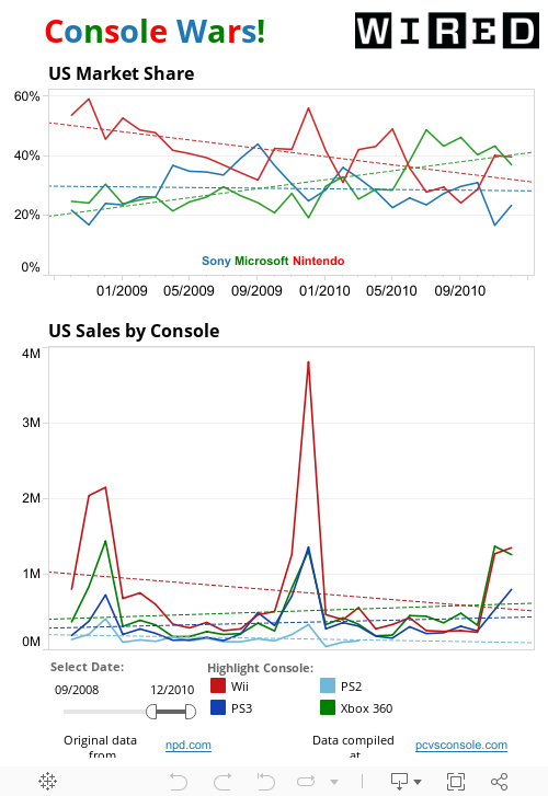
Set the slider to the far right and the far left. Use your mouse to hover over the various lines to see the numerical data.
1. What are all of the game consoles listed on the US Sales by Console graph?
2. What is a good title for the y-axis?
3. When do all of the consoles line graphs spike up? Why is this?
4. Click on PS2 in the key. What do you notice about the line? Why do you think the graph is going in this way?
5. Click on Game Cube in the key. When does it's line disappear? Why do you think it is no longer on the graph?
6. Click on Wii in the key. When does the Nintendo Wii first show up on the graph?
7. Move the slider so the left side is on 12/4/2008 and the right side is on 12/1/10. Hover over the line for the Wii to get the data from 01/2009 through 12/2010 (data from each month). What was the mean, median, mode, and range number of sales for the Wii?
NOTE: If you have probems viewing the visualization in Blogger, click
http://public.tableausoftware.com/views/ConsoleSales/ConsoleWars?:embed=y&:toolbar=yes&:tabs=no
Bunch Math Lessons Blog by Bunch Math Lessons is licensed under a Creative Commons Attribution 3.0 Unported License.
No comments:
Post a Comment